
Circle Tone Butterfly

Hello, and welcome to my blog! This is my first blog post since being chosen to be an inspiration team member for Brutus Monroe. I couldn't be more excited! I love Brutus Monroe products and will enjoy sharing my work using their items. I was feeling a little mixed media vibes when I created this card. I love geometric shapes and butterflies! I thought the contrast between the two added interest. The sentiment is perfect because I'm giving this card to my husband. I'm always telling him "you are my sunshine!"

I started today's card by stenciling this cardstock with Blueprint Sketch Distress Ink on top of Circle Tone Mixed Media Stencil. I inked darker in the center, then faded to pale blue around the edges. Pro Tip: When stenciling, apply in in circular motions going both clockwise and counterclockwise to add depth to the image and get a more complete image .


I used a script background stamp from my stash. This helps draw the eye towards the butterfly, which is the focal point of the card.

I stamped all three butterflies from Brutus Monroe's Butterfly Sentiment Stamp Set, but ended up using only one. I wanted a single focal point to keep this card clean and simple as possible.

I colored this beautiful butterfly with B63, BV13, YR12, and Y13 Copic markers. I chose blues that matched the Blueprint Sketch and yellows because they are complimentary colors. It's not pictured here, but I added Glossy Accents to the body and antennae of the butterfly and Sterling Shimmer Splash to the wings. You can see this in the final picture.

I cut out a ring by placing a small circle die within a larger,  and cutting it from white cardstock. I took the ring and applied embossing ink to it. I sprinkled Gilded embossing powder from Brutus Monroe onto that, then melted it with a heat gun. This is a great way to make hack to create cardstock the exact color you wish!

Another way to achieve the perfect colored cardstock is by going direct to paper with your ink pad. I only needed the outside edges colored, but I wanted it to match the ink on my stenciling. So, I used Blueprint Sketch Distress Ink here, too.

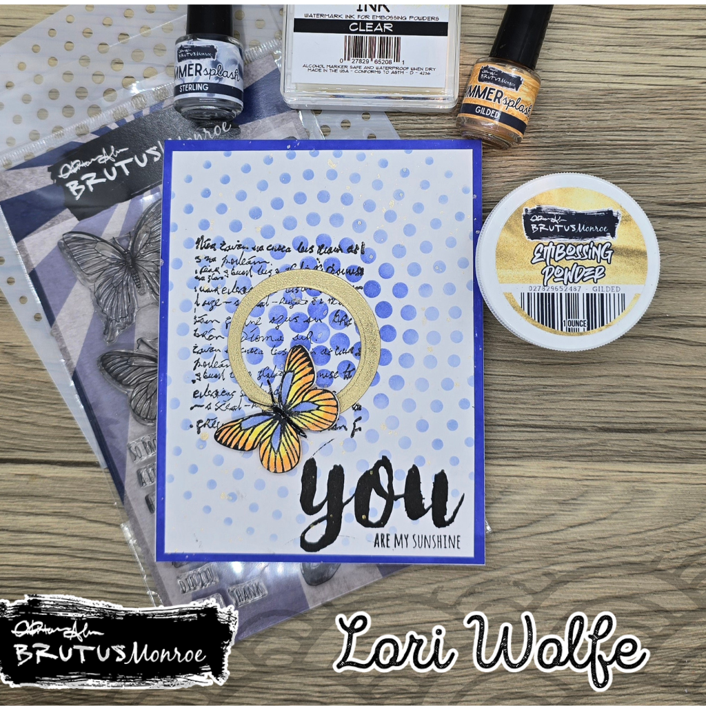
Finished card. I had a lot of fun creating this! I love all the layering and texture I was able to achieve. There's also a lot of shimmer and shine going on with Glossy Accents and Shimmer Splash on the butterfly, the gold embossing powder on the ring, and Shimmer Splash added to the background.  I'm really enjoying working with Brutus Monroe products that I haven't used in the past.


Comments

Popular posts from this blog

Friday April 23, 2021

Springtime Slimline It's finally spring and the flowers are starting to bloom outside and in my craft room! Today, I made this spring-themed birthday card for my niece. I was inspired by Jennifer McGuire. She made a video two years ago who where she made a card similar to this. If you don't know who she is, her channel is a must watch!  These floral framed tiles look like stained glass. Like my post a week ago, I used Distress Oxides to get the watercolor effect of their backgrounds. Products needed for this card are Distress Oxides or other water-reactive ink, blending brushes or other blending tool, a slimline card base, pieces of white cardstock, a piece of halographic cardstock, square frame dies (I used these from Pinkfresh Studios), and a sentiment die (I used a border die from Lawn Fawn). I started by randomlly ink blending with green and blue oxides. By blending ink first, the completed look is more striking. If you want a more subtle background,...

Decorations-1

Hello, and welcome to my blog. For today's post, I am once again a guest designer for Christmas Craft Creations. This month's theme is decorations. One of the first things I put up for Christmas is our stockings, so I had to create a card with a stocking. I used Spellbinders Stocking Full of Joy die set.  I didn't have a red cardstock the color I wanted. Something I do often is adding ink direct to paper. This is basically creating your own colored cardstock. I used Altenew's Crisp Dye Ink in Vineyard Berry, then die cut the stocking. I used Aged Mahogany Distress Ink to add shadows. I cut the top of the stocking and loop from Simon Says Stamp Matte Gold Cardstock.  I used different shades of green to make the foliage appear more organic. The red berries are cut from the first inked paper. For the white berries, I again went direct to paper with Antique Linen Distress Ink. Once the items are finished and ready ...

Add A Hat-2

Hello, and welcome to my blog! I made this cute penguin card for Christmas Craft Creations. This month's theme is Hats On. I love the warm hats that these penguins are wearing. I'll walk you step-by-step through this card. I started with Lawn Fawn's Here We Go A-Waddling stamp set. I stamped out the trio of carolers, the guitar player, and the lamppost. I colored the images with Copic markers: C9, C6, C3, C2, BG09, BG18, RV69, R29, R20, V17, V15, G46, G28, Y26, YR24, E59, E39, B000, Y17, Y15, and YR 18. I cut two snow banks out of Neenah Classic Crest Cover Solar White 80lb cardstock with Lawn Fawn's Stitched Hillside Borders. I then used Stormy Sky and Tumbled Glass Distress Oxides to ink the edges of the banks. Pro tip: use a light color, e.g. blue or grey, to line the edges of a white image to give it more depth. I took an A2 panel in landscape position and inked the top 3/4 with Hickory Smoke Distress Oxide. Then, using the new Ra...